Designing a space that truly promotes relaxation involves more than just selecting comfy furniture. In fact, the paint color you choose for your walls is just as important—and choosing the right shade can have a huge impact on your mood at home. Take some inspiration from these calming examples, from bedrooms to living rooms and everything in between, which will inspire rest and relaxation without sacrificing style.
Oh and when that’s all set, make sure you do everything you can to really make your space a place to destress–get rid of clutter, have soft pillows nearby, and light your favorite candle.
To some, color is pretty matter of fact: Everyone has their own likes and dislikes, shades they consider beautiful, and shades they do not. While you may be tempted to paint your home in the hues you deem most attractive, understanding the psychological effects of a tone can help you achieve a specific mood, energy, and ambience in your interior spaces. “It’s not just plush pillows and cozy throws that creates a tranquil environment, a wall color can have a big impact on the overall feel of the room,” says Benjamin Moore color and design expert Hannah Yeo.
Without even realizing it, you may be creating an undesirable environment in your home due to the colors you throw on your walls. There’s a reason why a bright red room might make you anxious upon entry. Chromo therapy, or color therapy, is the increasingly popular practice of using color to stimulate positive emotion and improve mental health. We spoke with top color experts, who explained which colors will help you find your zen–and which will make your stress-levels soar.
SHADES OF BLUE AND GREEN

Björn Wallander
“Shades of blue or green are always very calming. Blues are especially known to have a relaxing effect perfect for creating a serene feeling at home,” says Nicole Gibbons, interior designer and founder of Clare Paint. “The perfect blend of the two–shades of aqua–offer the best of both, conjuring up tranquil ocean vibes that make any space feel instantly calm.”
“Blues and greens are inherently calming because they remind us of nature. Imagine looking out over the ocean on a beautiful day, or sitting in nature looking up at the trees,” says Jamie Davis, co-founder of Portola Paints.

Douglas Friedman
“Everyone has their own preference on relaxing colors, but soft cooler colors seem to feel right for most,” says Hannah Yeo. “For instance, light sages and sky light blues are often associated with spa-inspired rooms. There’s also some scientific research indicating that due to the short wavelengths of cooler colors and how our cones perceive them, greens and blues are the most relaxing to our eyes. Easily put, greens and blues colors are simply less tiring to the eye.”
Here are blue and green color pairings, selected by the pros:
TRY: Headspace by Clare
Shop Now
$2/Swatch

Courtesy of Clare
PAIR WITH: Whipped by Clare
Shop Now
$2/Swatch

Courtesy of Clare
TRY: Views by Clare
Shop Now
$2/Swatch

Courtesy of Clare
PAIR WITH: Snow Day by Clare
Shop Now
$2/Swatch

Courtesy of Clare
TRY: Smoke by Benjamin Moore
Shop Now
$10/Pint

Courtesy of Benjamin Moore
PAIR WITH: Stone Harbor by Benjamin Moore
Shop Now
$10/Pint

Courtesy of Benjamin Moore
TRY: Atwater by Portola Paints
Shop Now
$10/Sample

Courtesy of Portola Paints
PAIR WITH: White Cliffs by Portola Paints
Shop Now
$10/Sample

Courtesy of Portola Paints
NEUTRALS

Nathaniel Johnston
Ever wonder why spas opt for lighter, more neutral palettes? “Light neutrals are also known for their calming effects,” says Yeo. “Think of a soft champagne with just enough shimmer to put you in a great mood. Pinks are also increasing in popularity—soft and sweet with a sense of security. The tint of warmth makes the room feel welcoming. In general, grays and neutrals with a hint of color makes us to feel comfortable in any given space.”
Here are neutral color pairings, selected by the pros:
TRY: No Filter by Clare
Shop Now
$2/Swatch

Courtesy of Clare
PAIR WITH: Timeless by Clare
Shop Now
$2/Swatch

Courtesy of Clare
TRY: Ancient Scroll by Portola Paints
Shop Now
$10/Sample

Courtesy of Portola Paints
PAIR WITH: Angel’s Landing by Portola Paints
Shop Now
$10/Sample

Courtesy of Portola Paints
TRY: Angelica by Benjamin Moore
Shop Now
$10/Pint

Courtesy of Benjamin Moore
PAIR WITH: Nightingale by Benjamin Moore
Shop Now
$10/Pint

Courtesy of Benjamin Moore
SHADES TO AVOID

Simon Upton
There are a few general rules when figuring out what shades to avoid. Saturated, primary colors tend to evoke feelings of stress or high energy. Jamie Davis explains that “Reds and oranges make you have a physical reaction, whereas blues and greens make you have an emotional reaction.” These colors are inherently more intense, which is why muted tones tend to have a relaxing effect. “If your goal is to create a calm mood, avoid vibrant colors like red, orange or bright yellows which are invigorating and full of energy,” says Nicole Gibbons.

Werner Straub

Lucia Tonelli
Assistant Editor
Lucia Tonelli is an Assistant Editor at Town & Country, where she writes about the royal family, culture, real estate, design, and more.
Stress can sneak up on you. It doesn’t take much to leave us feeling anxious and stressed-it could be as simple as feeling busy at work, or just feeling like you don’t have enough time in the day to get everything done. The good news is that you can help to keep your stress levels low simply by using the right paint colors in your home.
Stress Reducing Colors to Calm You
You might not even notice it, but your body and your mind both have reactions to seeing colors. Brighter colors usually stimulate your brain and energize you, potentially even making you feel a little anxious. When painting rooms in your home, you want to think about how you want to feel when you’re in the room. If relaxation is your goal, there are certain colors to consider.
Blue
Blue is a classic color that many turn to when decorating their homes. There’s a good reason for that-blue is quite a soothing color and can help to calm a busy mind. It’s an ideal color to use in a bedroom since it can actually help you sleep. As for which shades to stick to, think very soft, neutral tones since bright colors might be too stimulating.
Violet
Violet has a blue base, so it makes sense that this color would also be quite calming. A soft violet or lilac tone can bring balance and inner peace. When choosing a shade of violet, look for something soft without too much black in it.
Pink
You might not immediately think of pink as a calming color since it has so many bright and vibrant versions. However, a soft pastel pink can definitely bring an element of peace and calm to a space. When choosing the right shade of pink, think soft and light, since brighter shades with too much red could leave you feeling overstimulated.

Green
Green is quite soothing and comforting. It makes perfect sense since this is the color we associate with nature and the outdoors. Green is present in most of the spaces we visit when we want to feel relaxed; parks, our backyards, and the quiet forest. Pretty much any shade of green will leave you feeling calm, but the lighter shades will have you feeling more chilled out than brighter versions.
Gray
You might be a little surprised to see gray on this list since it’s often seen as being a bit dull and boring. Some might think it’s even a little depressing since we sometimes feel a bit low on days where the sky is very cloudy. However, the right shade of gray can actually be very calming and relaxing. It’s a perfect neutral color, which means it works well with pretty much any color or palette. It’s a great option for any room in your home.
Tan
Tan is another one that might not immediately come to mind for people. It’s a great neutral and works well as a base for highlighting other colors. There’s a warmness to it that reminds us of candlelight, which is incredibly relaxing.

White
White is an interesting one since subtle differences in the shade can create very different reactions in people. If you go too dull, it might be a bit of a downer. If you go too bright, it can seem too clinical and actually stress you out a bit. The key to keeping things calming with white is to stick to warmer, creamy versions.
Yellow
A bright yellow is very stimulating and might have your mind running a mile a minute. However, a very light, soft pastel yellow feels very soothing. The right shade of yellow can leave you feeling like you’re being bathed in warm rays of sunshine. It doesn’t get much more relaxing than that!
Mixtures
You can create variations on calming colors by blending any of these gorgeous tones together. For example, blending violet and gray will create a soothing lilac gray hue, or a pink and tan can combine to create a softer warm pink.

Gray makes a great base for blending with any brighter color to create a cool, calming tone that won’t seem too overwhelming or distracting. It works beautifully when blended with violets, greens, and blues.
What is the Most Soothing Color?
It won’t surprise you to learn that it’s blue! When we’re feeling stressed out, we subconsciously look to blue. We might look up to the sky for a bit of daydreaming to calm down or take a trip to the beach to stare out into the water and enjoy some quiet time. In fact, it’s said that looking at the color blue can produce chemicals in the body that promote calming.

If you don’t want to go full-on blue in every room in your home, you’ll still feel the calming effects by choosing colors that have elements of blue, such as a warmer gray, blue-green, or soft purple.
Want more inspiration? Read our other blog posts:
Easy Home Improvement Ideas to Increase Home Value | What is the Best Paint Color for Dark Rooms? | The Best Paint Colors For Selling A House | How To Use A Paint Color Wheel | 10 Beautiful Bathroom Paint Colors For Your Next Renovation
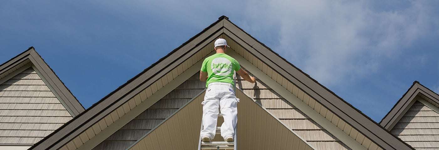
Are you ready to paint your home or bedroom to a more soothing color? Click here book a free estimate: